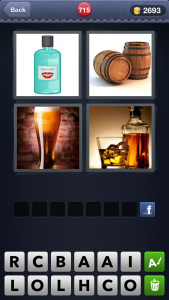
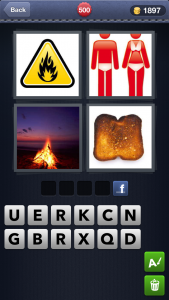
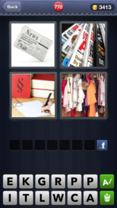
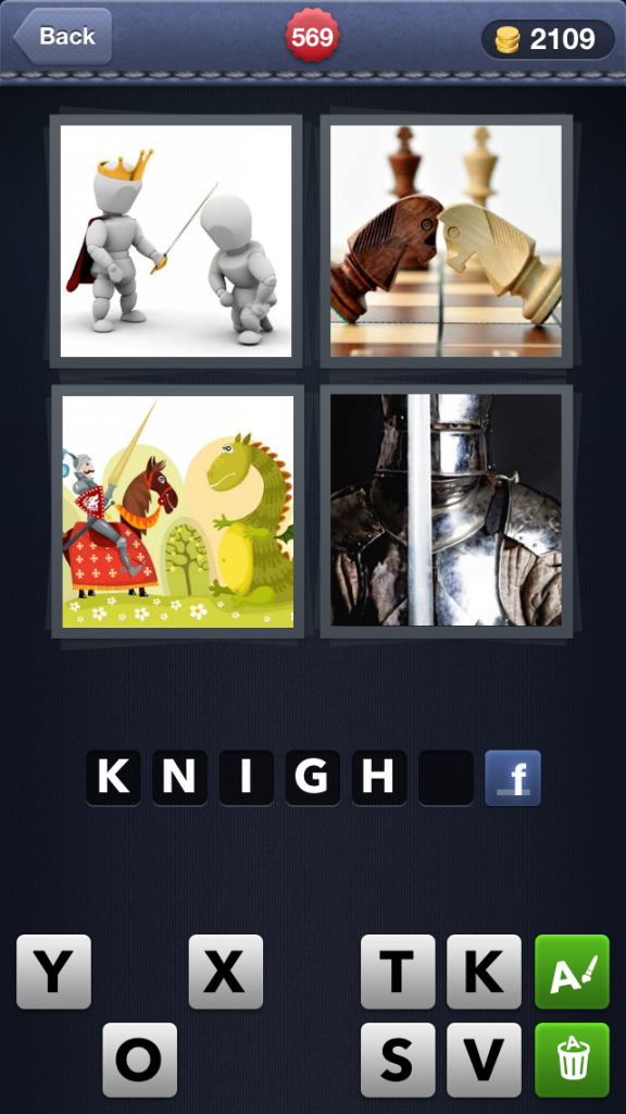
Quite a few of my friends have been playing a little game on their smartphones lately called ‘Four Pics, One Word’ (which brings up immediate and somewhat alarming correlations with the ‘Two Girls, One Cup’ thing, which is no doubt deliberate, but I digress!) and I know this to be true… because when they run out of coins they are posting their harder puzzles to Facebook and asking the hive mind for assistance! 🙂
|
|
Four Pics, One Word is essentially word puzzle game – you are provided with four images that are connected in some way, along with twelve letters that create a word which relates to all four images. Some of the visual clues are very straight forward and the answer will leap out at you straight away.
And then others tend towards the somewhat obscure and require a bit of lateral or abstract thinking to figure out the correct word. That, or putting it aside and looking at it with fresh eyes later and you can usually figure them out as they don’t seem to get more difficult as you go along.
So you sail through a few and then actually have to look at the puzzle for a few seconds. Personally, I find this game fairly straightforward and haven’t used the ‘coins’ you get for getting the words correct (they can be used to delete letters from the options or to purchase a letter in the word I believe). This is probably because many moons ago I did a Bachelor of Visual Arts degree where they inflicted things like ‘Reading the Visual’ and ‘Visual Perception’ and ‘Communicating using Images’ onto us, so dissecting art, symobls or visual imagery and relating to them as concepts and words has become second natur over the years.
But what I really love about this little game is the beautiful quality the game has about it. It’s very polished looking, the images are all professional stock photography, the letter tiles are very smooth and easy to read, and it’s a simple design and layout… it’s really just a rather pretty meadow, I guess.
But, (and y’all knew there was a big old ‘but’ coming!) there is something that is driving me absolutely nuts about this game. And it’s the advertisements. They pop up about every half dozen words guessed, probably more frequently than that in all honesty and given the little word puzzle game is free, the ads are inevitable yes? However, it’s not the actual presence of the ads that is annoying me… it’s the visual presentation of them! Here the developers are having spending considerable time and energy creating a game that is visually quite stunning on a little handheld device only to turn around and have it frequently polluted for their users by throwing in ugly looking advertisements for other cheap and nasty looking games. WHY? Surely they could be putting up more targeted advertising than this? Why something that is so incongruous with the quality of the game in which they are putting them?
Urgh… the ugly keeps interrupting my little game, setting off my OCD, and making me twitch like mad! I just know I’m going to cave and buy the Premium version of the game for the grand total of USD$1.99 just so I won’t be visually assaulted with these horrid cheap looking ads!

