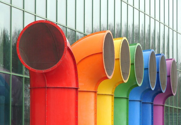
Years ago, in the way back when machine and I was 15 going on 25, but still in high school… we had a bathroom that was painted in bright rainbow colours. Each stall was painted a bright primary colour and across the front of the doors was a large horizontal rainbow of colour. At some point in the late 80s, it was determined that bright colours are agitating and excitable to young people (this was a private Catholic girls’ school, mind you) and the entire bathroom was sadly painted over in a hideous ‘salmon pink’ that was supposedly designed to be calming and studious. It was just disgusting and bland… and we hated it.
Most colours have corresponding psychological associations as perceived by (North American, British and Australian) mainstream culture. They are as follows:
Red… excitement, strength, sex, passion, speed, danger.
Blue… (most popular colour btw) trust, reliability, belonging, coolness.
Yellow… warmth, sunshine, cheer, happiness
Orange… playfulness, warmth, vibrant
Green… nature, fresh, cool, growth, abundance
Purple… royal, spirituality, dignity
Pink… soft, sweet, nurture, security
White… pure, virginal, clean, youthful, mild
Black… sophistication, elegant, seductive, mystery
Gold… prestige, expensive, tradition, heritage
Silver… prestige, cold, scientific
But psychological associations of colour can also be subjective and cultural, so that list isn’t comprehensive or by any means exhaustive. For example, white is the color of death in Chinese culture, but purple represents death in Brazil. Yellow is sacred to the Chinese, but signified sadness in Greece and jealousy in France. In North America, Britain and Australia green is typically associated with jealousy and people from tropical countries respond most favorably to warm colours whereas people from northern climates prefer the cooler colours!
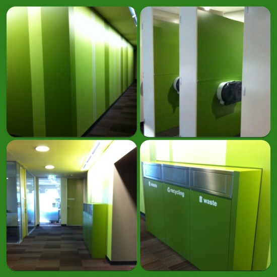
Yet none of this explains why… oh God why?!?!… the Steam Pipe Trunk Distribution Venue where I am currently working on a daily basis is largely decorated in that aesthetically offensive lime-green and charcoal colour combination currently favoured by public libraries the country over. It’s perfectly horrid and I find myself having an emotional reaction every time I walk in the place! The walls are green, the doors are olive green, the bins are green, the soft furnishings are green, the pin boards are green… even the goddamn toilets are green! Natural, cool, growth and abundant, indeed! 🙁
Seriously!!! If one is unhappily devoid of the colour sense, it is my best advice that one ought to avoid interior design as a career choice!!! 🙁 Fuck all you loathsome lime-green lovin’ library decorators!


we are personally effected by colour and the like or dislike of a colour reflects deeper subconscious behaviour and thought patterns like conditioning and experiences. If you want to get a deeper understanding, you can visit my website and do the free colour test, with kindest regards, Thelma